TintHintColors
Transform Your Space: Minimalist Neutral Color Palettes That Spark Serenity
Minimalist spaces don’t need to feel cold or empty. The secret to making them look warm, stylish, and inviting lies in choosing the right neutral palette. Neutrals are timeless, easy to pair, and give you endless flexibility when styling your home.
If you’ve ever wondered which neutral colors work best in minimalist decor, this guide will walk you through some tried-and-true palettes.
But, Why Neutral Palettes Work in Minimalist Decor?
These shades naturally bring a sense of calm into a space. Vibrant colors can feel exciting at first, but most people eventually find themselves drawn back to neutrals. Their true strength lies in their timeless appeal. Whites, beiges, and grays never go out of style, which means you won’t be repainting every couple of years just to keep up with trends.
On top of that, neutrals make experimenting much easier. They act as a flexible backdrop where you can layer textures, introduce bold accents through artwork or cushions, and swap decor seasonally without ever clashing with the foundation of your home.
Here are 3 Neutral Color Palette Ideas to Get you Started
1. Warm Neutral Palette
A warm neutral palette brings comfort and coziness into a space. With shades like beige, taupe, and soft browns, it creates a welcoming atmosphere that feels both timeless and inviting. Perfect for living rooms and bedrooms, these hues add depth and warmth without overwhelming the space
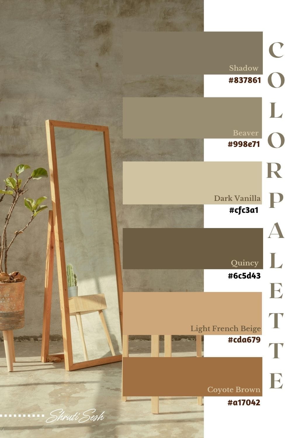
Here are the names and the hex codes for the above palette:
#837861 Shadow
#998e71 Beaver
#cfc3a1 Dark Vanilla
#6c5d43 Quincy
#cda679 Light French Beige
#a17042 Coyote Brown
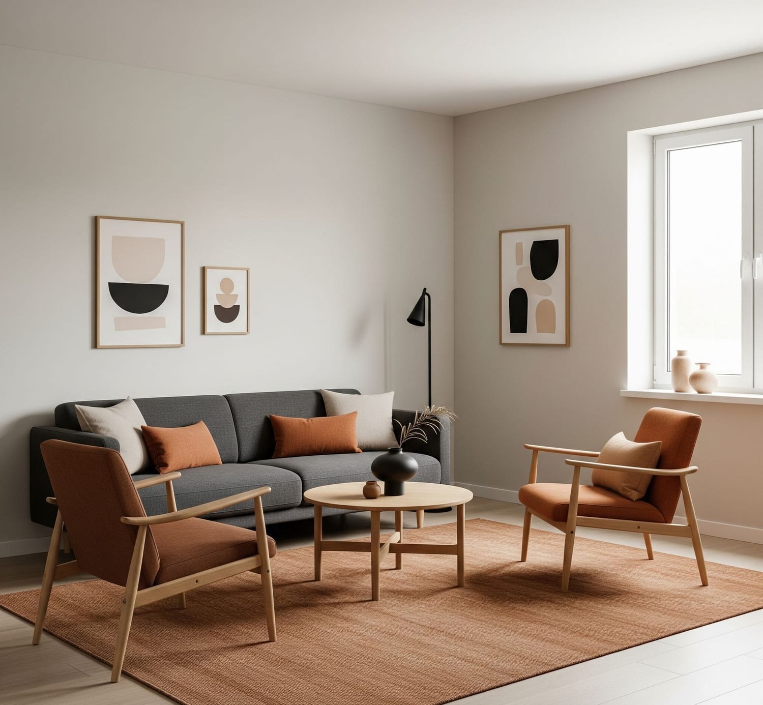
Living Room Reference for the above color palette
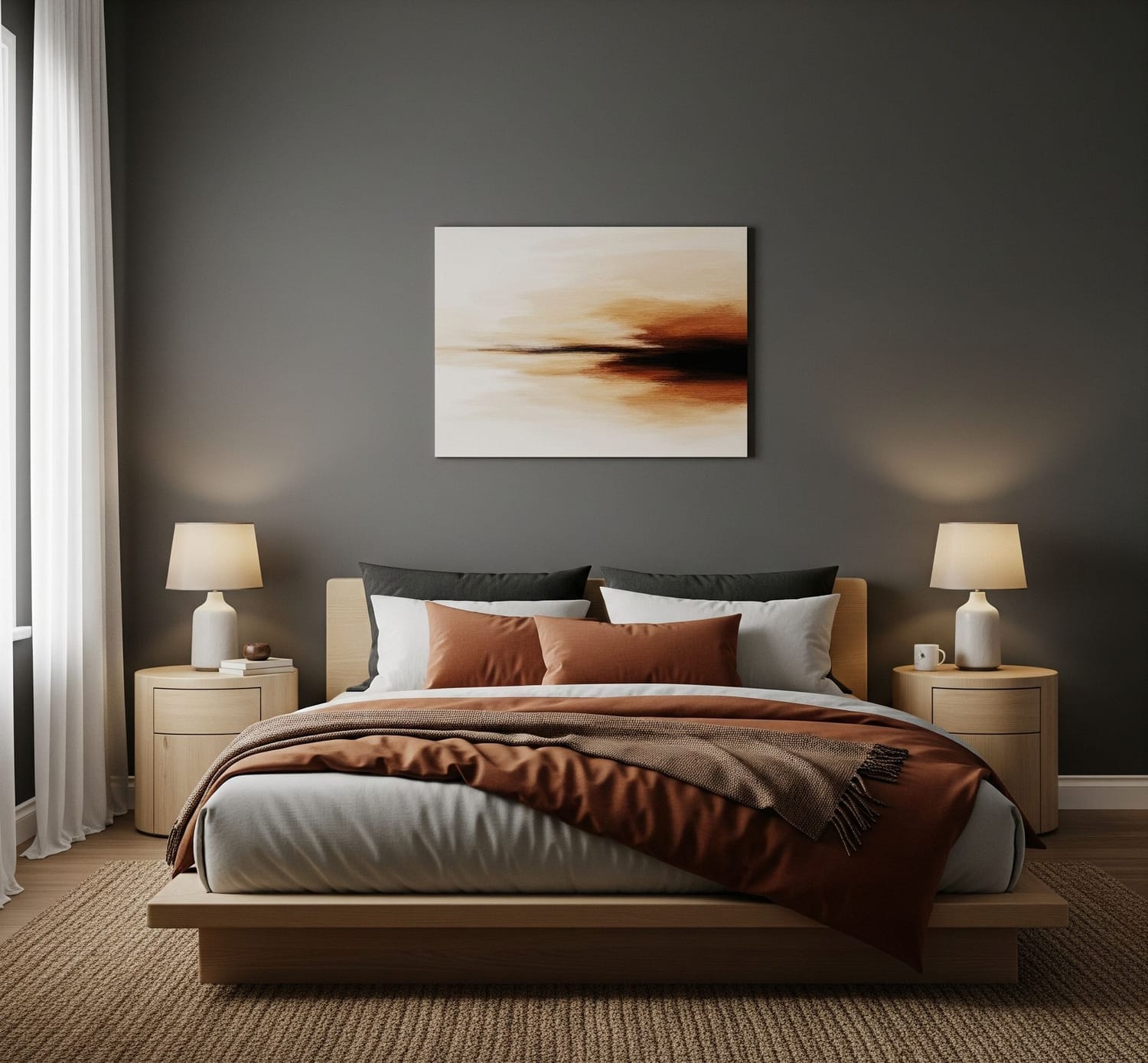
Bed room Reference for the above color palette
2. Brown Neutral Palette
From light tans to deep chocolates, these tones add warmth, stability, and a natural sophistication. Perfect for creating cozy yet refined interiors, brown neutrals pair beautifully with wood, stone, and soft textiles.
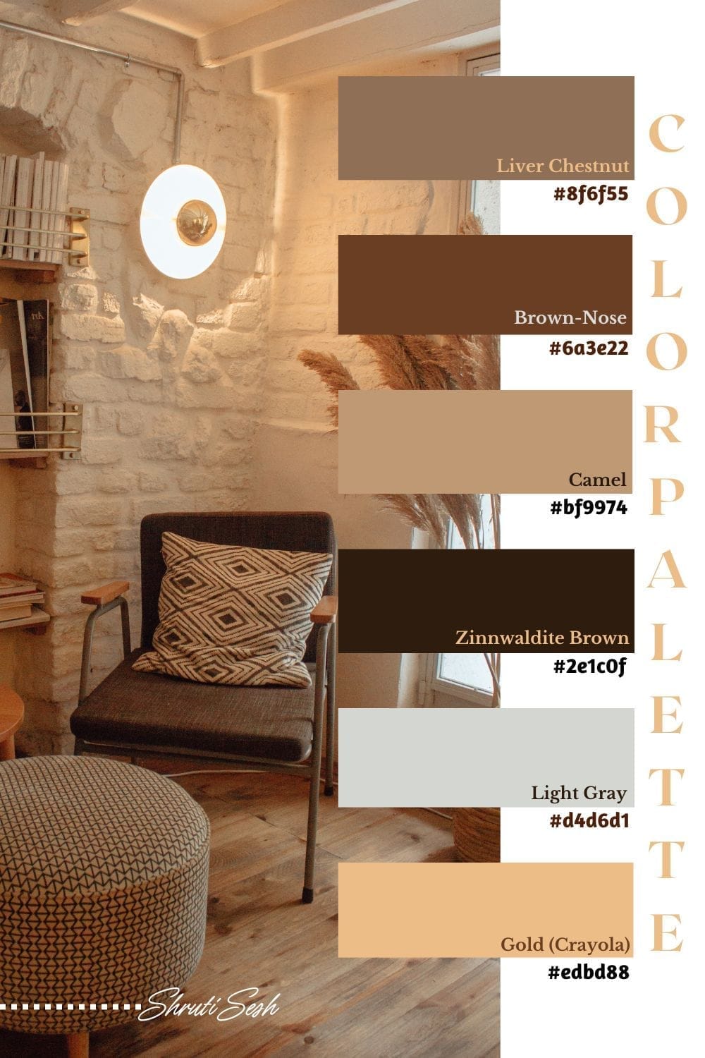
Here are the names and the hex codes for the above palette
#8f6f55 Liver Chestnut
#6a3e22 Brown-Nose
#bf9974 Camel
#2e1c0f Zinnwaldite Brown
#d4d6d1 Light Gray
#edbd88 Gold (Crayola)
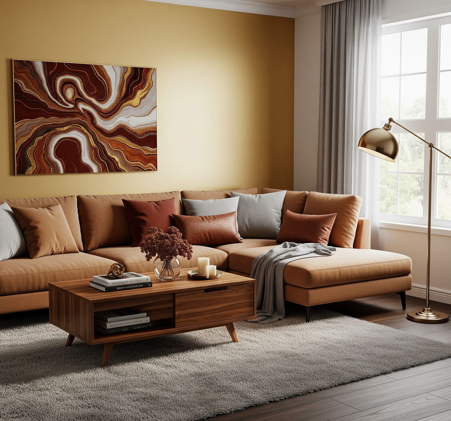
Living room Reference for the above color palette
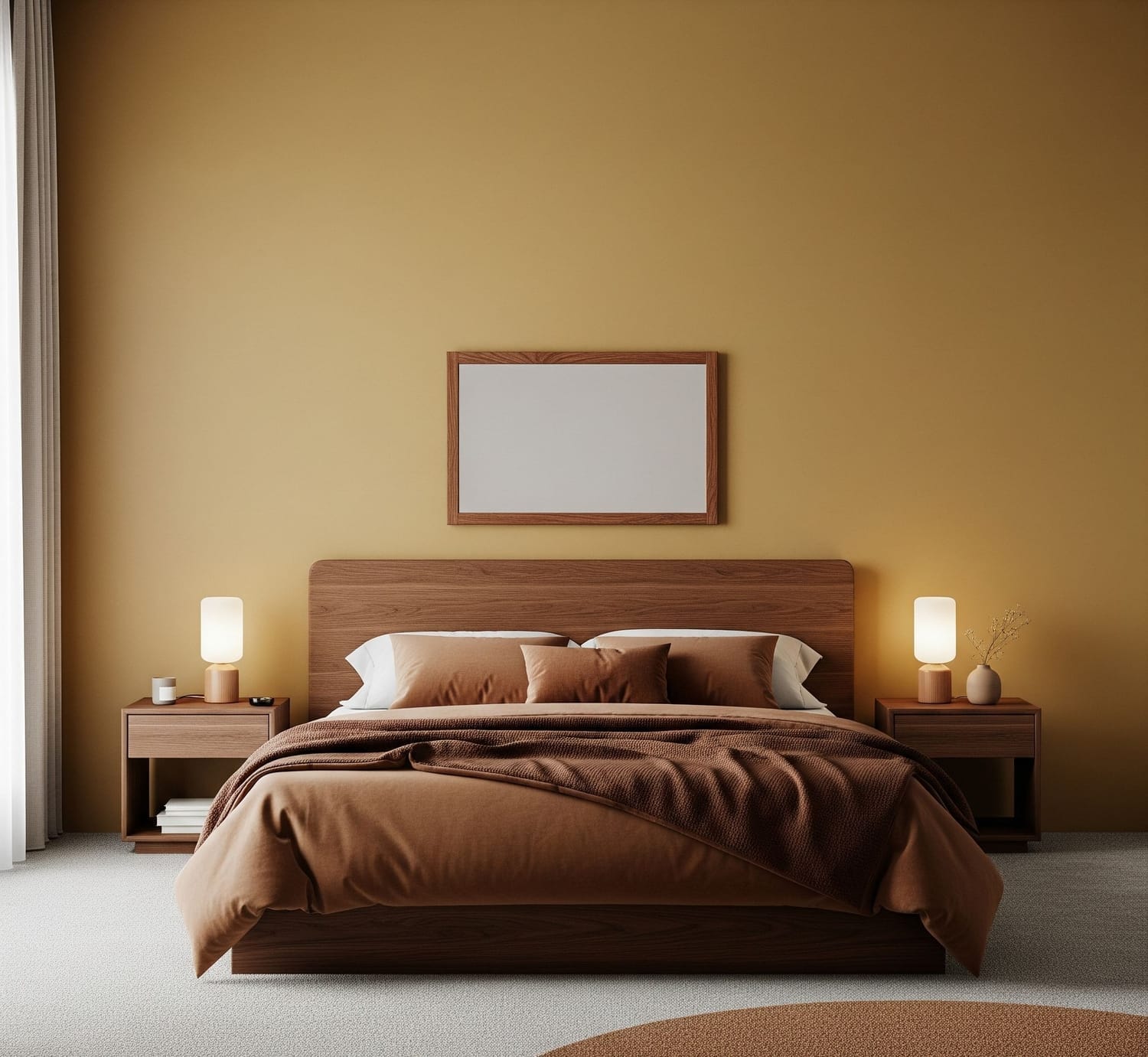
Bed room Reference for the above color palette
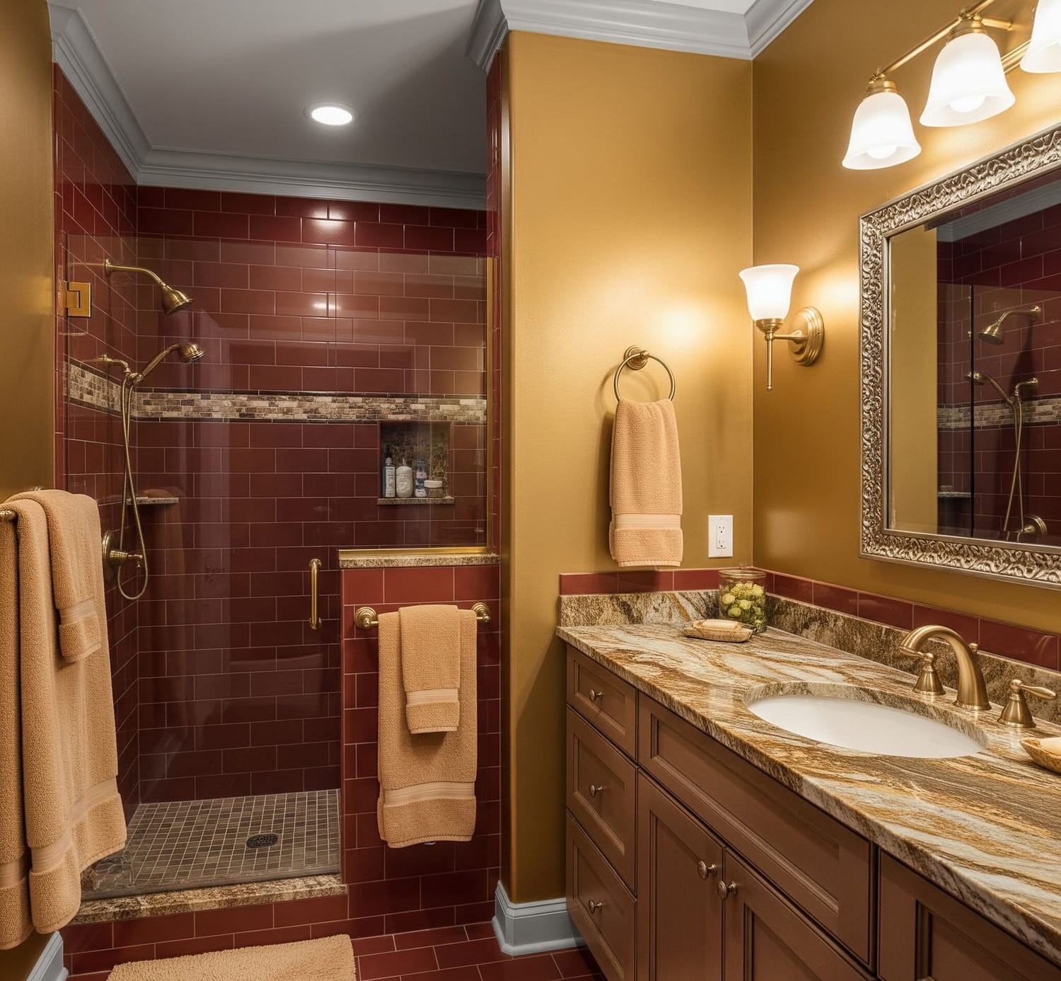
Bath room Reference for the above color palette
3. Earthy Neutral Palette
Earthy neutrals feel natural and lived-in. These shades create a calm, organic atmosphere that feels both timeless and connected to the natural world, making them ideal for minimalist and cozy interiors.
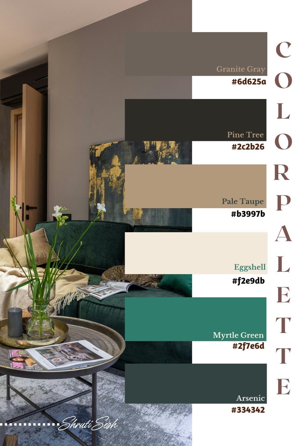
Here are the names and the hex codes for the above palette
#6d625a Granite Gray
#2c2b26 Pine Tree
#b3997b Pale Taupe
#f2e9db Eggshell
#2f7e6d Myrtle Green
#334342 Arsenic
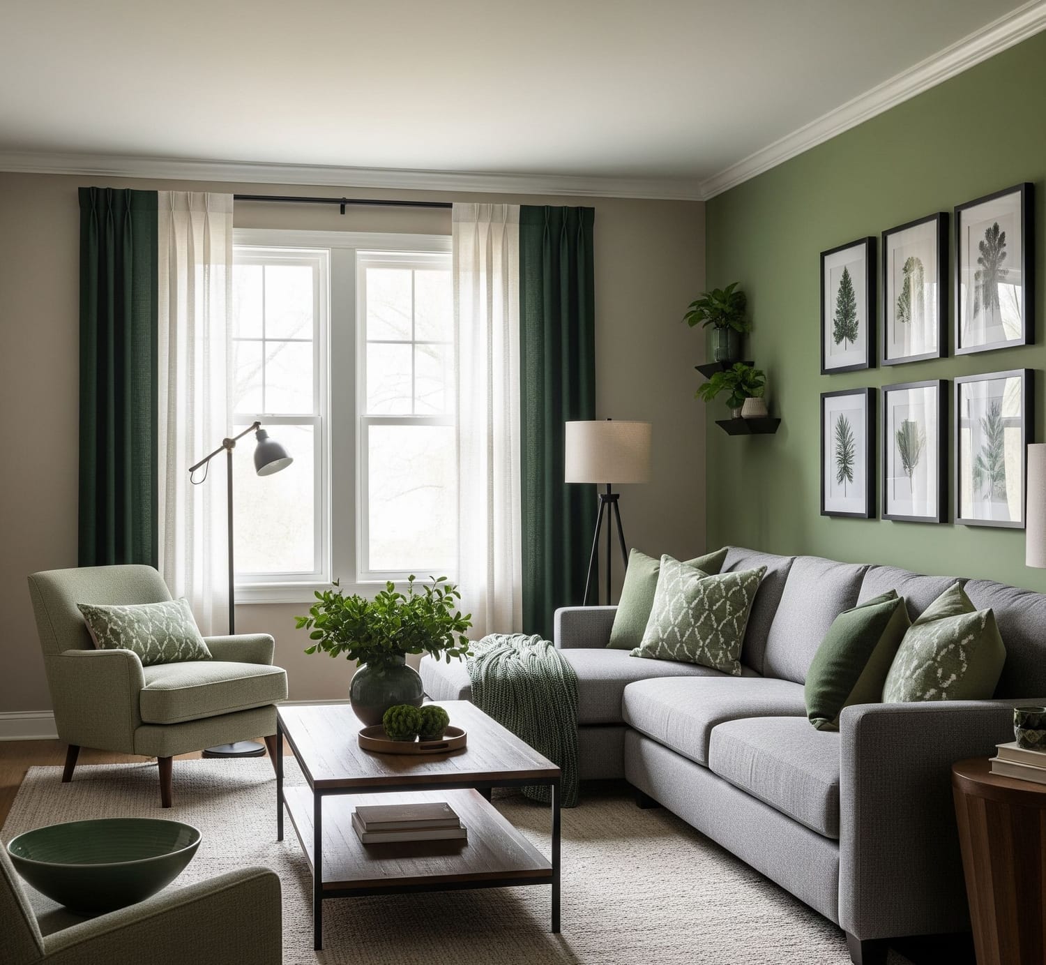
Living Room Reference for the above color palette
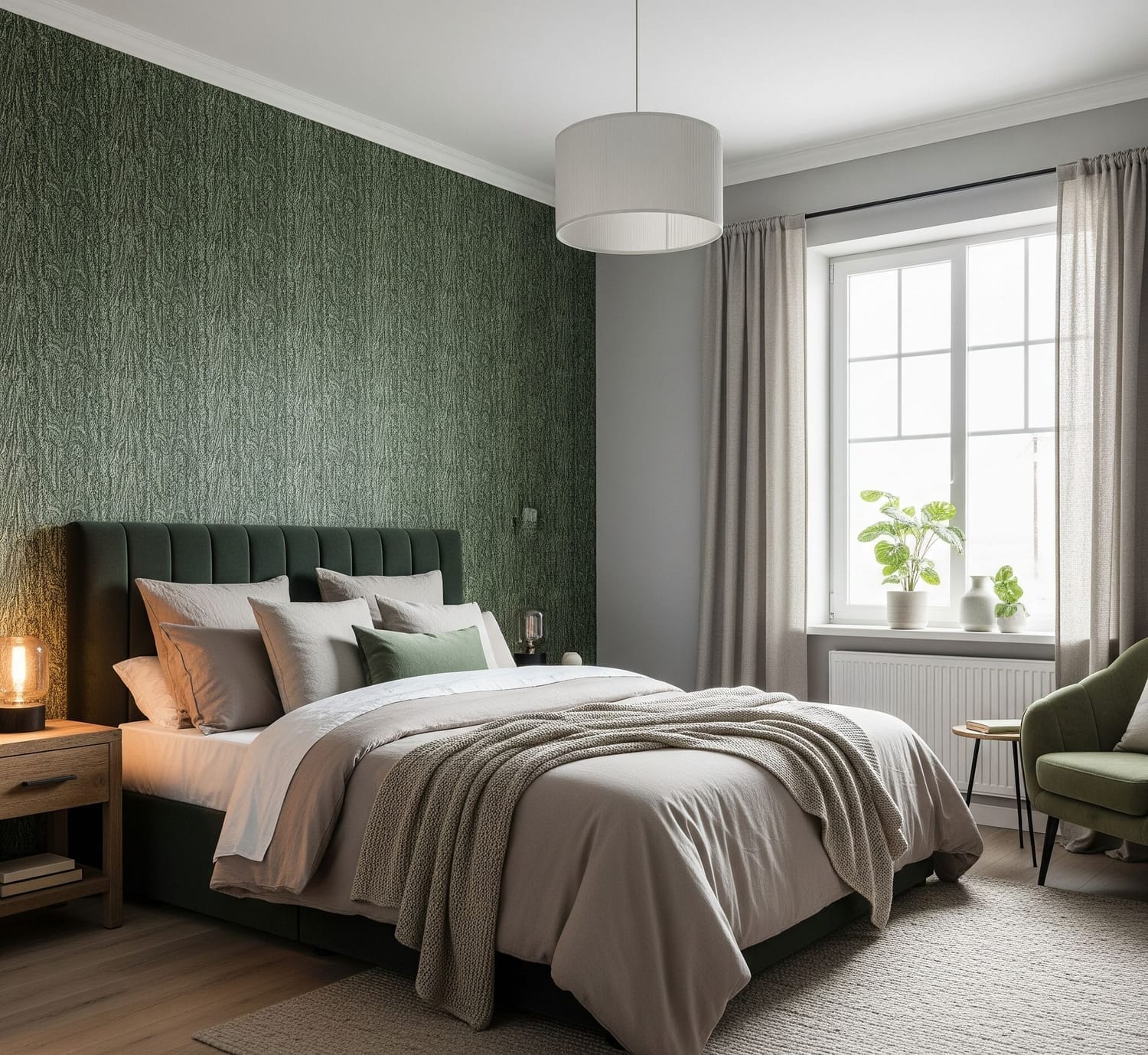
Bed room Reference for the above color palette
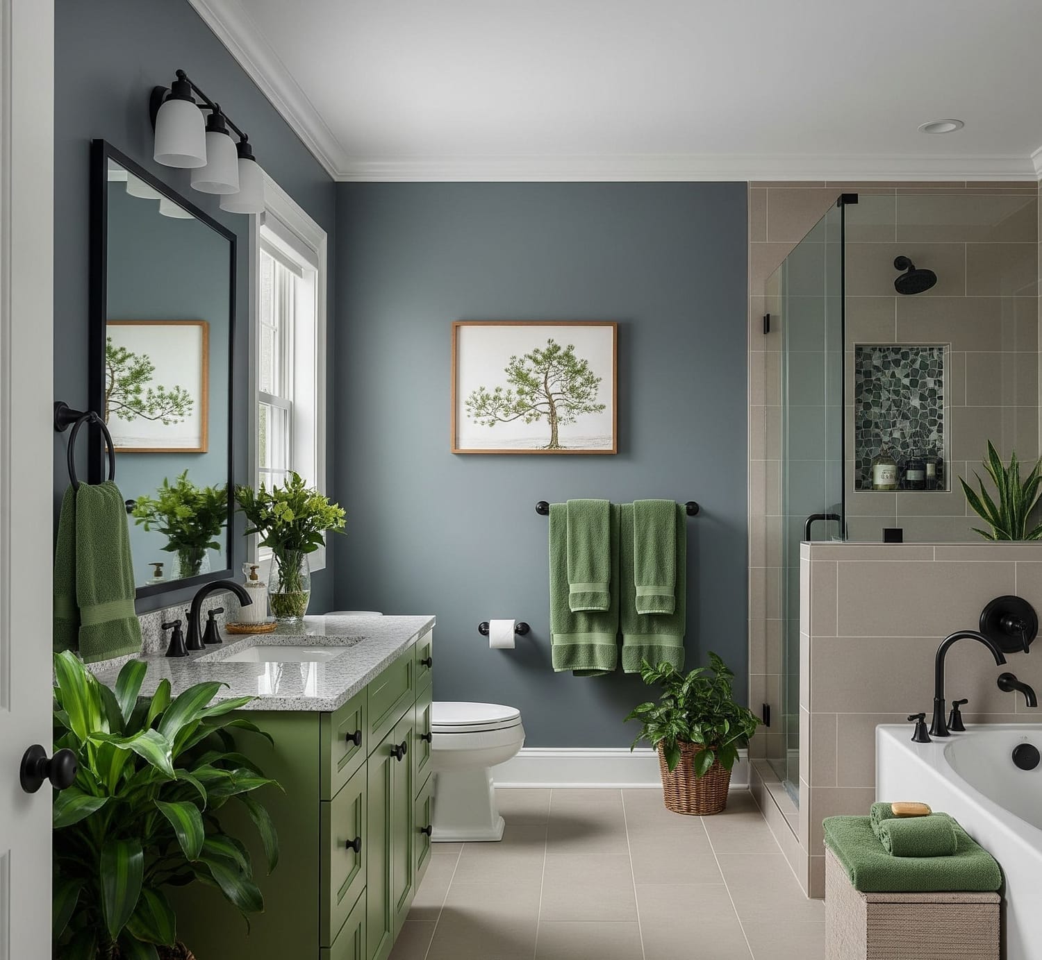
Bathroom Reference for the above color palette
So, here I tried giving you an idea about the beauty of neutral color palettes for home décor. These shades can be easily paired with trendy tones to add a pop of personality to your living space....
Don’t be afraid to experiment with colorful furniture, statement paintings, or unique accent pieces—the right blend of neutrals and pops of color can create a home that feels both stylish and welcoming.
With this, I’ll sign off for now—thank you for reading, and I’ll see you in the next one.....
About My Blog
Greetings! I am Shruti S., and I am very, very, VERY new to blogging.
This little space is where I’m learning, experimenting, and sharing as I go. I have always been in love with colors and curated color palettes. Pinterest inspired me to start creating palettes of my own, and soon I found myself using them to choose clothes, decorate my space, and bring more harmony into my everyday life. What began as a simple hobby slowly turned into a passion, and now this blog is where I collect, share, and celebrate the beauty of colors.
Created with ©systeme.io