TintHintColors
Platinum, Blush, and Rich Browns for Design Inspiration
Here's another one from the ‘daily home decor color palette inspo’ series. This is one of the older color palettes I posted on my Pinterest.
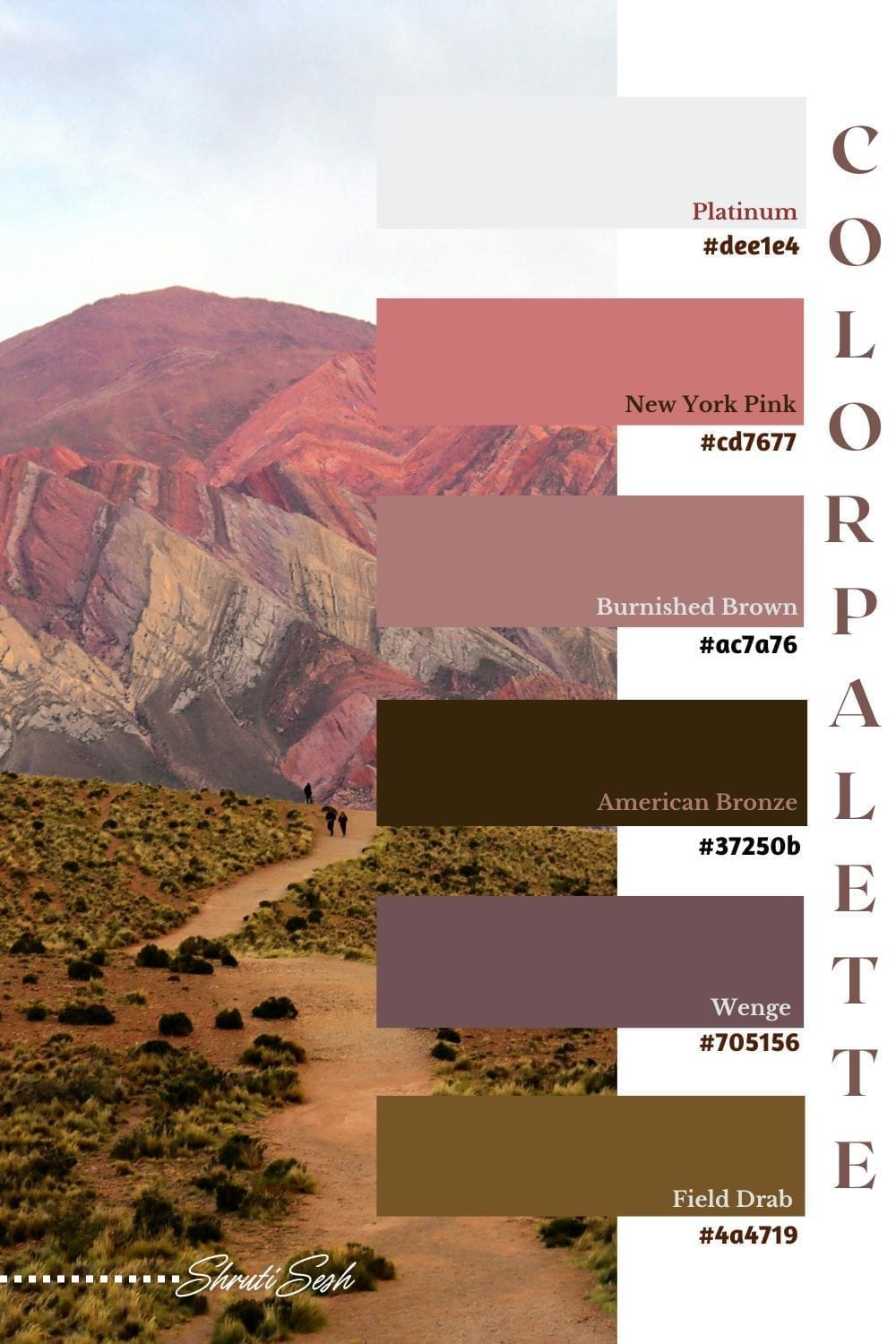
The Palette
#dee1e4 (Platinum): A very light, neutral gray with a hint of coolness. It's a versatile base color that creates a sense of airiness and calm. In the visual, this color is used for the walls, providing a subtle backdrop that allows the other colors to stand out without feeling overwhelming. Alternative name Light Gray.
#cd7677 (New York Pink): This is a warm, desaturated pink-red. It has a soft, earthy quality reminiscent of clay pots and adds a touch of organic warmth and natural texture to the space. It can be a lovely accent color. Alternative name Muted Terracotta
#ac7a76 (Burnished Brown): A brownish-beige with a reddish undertone. It's a comforting and cozy color that feels warm and inviting. It is a Warm Beige.
#37250b (American Bronze): A very dark, rich brown with a hint of yellow, giving it a warm, almost chocolatey feel. This color provides a deep, grounding contrast to the lighter hues in the palette, adding sophistication and visual weight. Alternative name Deep Brown
#705156 (Wenge): A deep, muted pink-brown. It is a more sophisticated and less vibrant version of pink, adding a sense of softness and romance without being overly sweet. It works well as an accent color for pillows and other small decor. Alternative name Dusky Rose.
#4a4719 (Field Drab): A very desaturated, dark olive green. This color provides a cool, natural contrast to the warm tones and adds a subtle connection to the outdoors. It's a great color for a touch of nature-inspired elegance. Alternative name Olive Green.
HOME DECOR INSPO
1. Living Room
This living room palette, a harmonious blend of muted and deep tones, creates a space that is both tranquil and inviting.
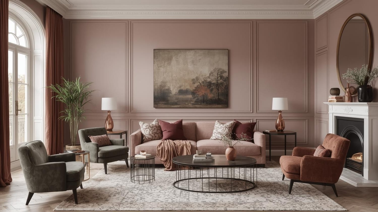
Living Room Inspiration for the color palette
2. Bedroom
The muted tones create a serene and calming atmosphere, perfect for a bedroom sanctuary.
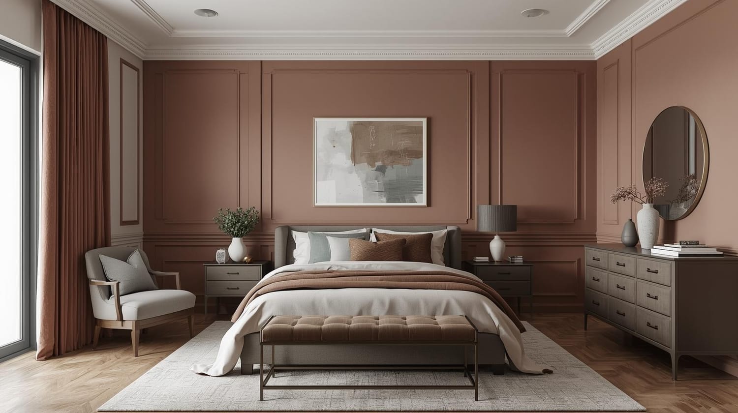
Bedroom Inspiration for the color palette
3. Kitchen
This kitchen design embraces a chic, earthy aesthetic, utilizing the same calming color palette.
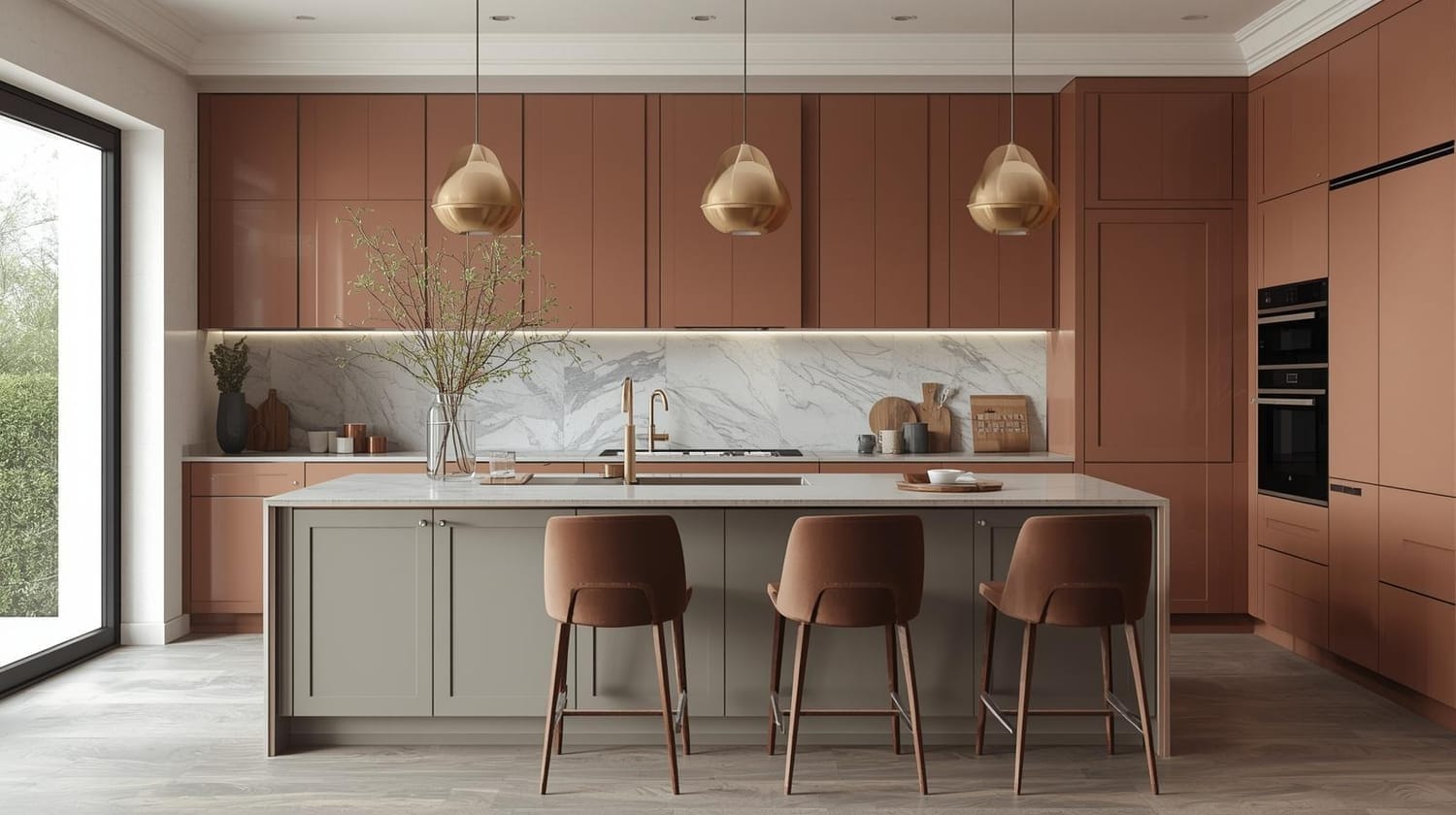
Kitchen Inspiration for the color palette
4. Bathroom
In this bathroom, the calming palette creates a spa-like retreat.
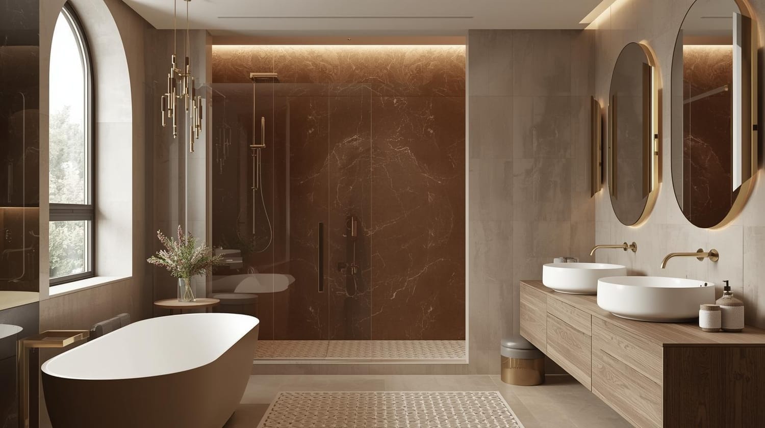
Bathroom Inspiration for the color palette
Creating a beautiful home is all about infusing your unique style and personality into every space. By thoughtfully using a cohesive color palette, you can achieve a harmonious flow from one room to the next, transforming your house into a truly curated and inviting sanctuary. So here was a little home décor inspo for this color palette—an invitation to play with shades that speak to you. Don’t be afraid to mix and match with other tones, layer textures, and bring your own personality into the space. Remember, the best interiors are born out of experimentation. Keep exploring until you find what truly works for you...
About My Blog
Greetings! I am Shruti S., and I am very, very, VERY new to blogging.
This little space is where I’m learning, experimenting, and sharing as I go. I have always been in love with colors and curated color palettes. Pinterest inspired me to start creating palettes of my own, and soon I found myself using them to choose clothes, decorate my space, and bring more harmony into my everyday life. What began as a simple hobby slowly turned into a passion, and now this blog is where I collect, share, and celebrate the beauty of colors.
Created with ©systeme.io